Mini case study — Figma Make-a-thon
MOST LIKELY TO SHIP 🏆
FIGMA MAKE-A-THON
2025
x

Vintage Networking Tool for Robots
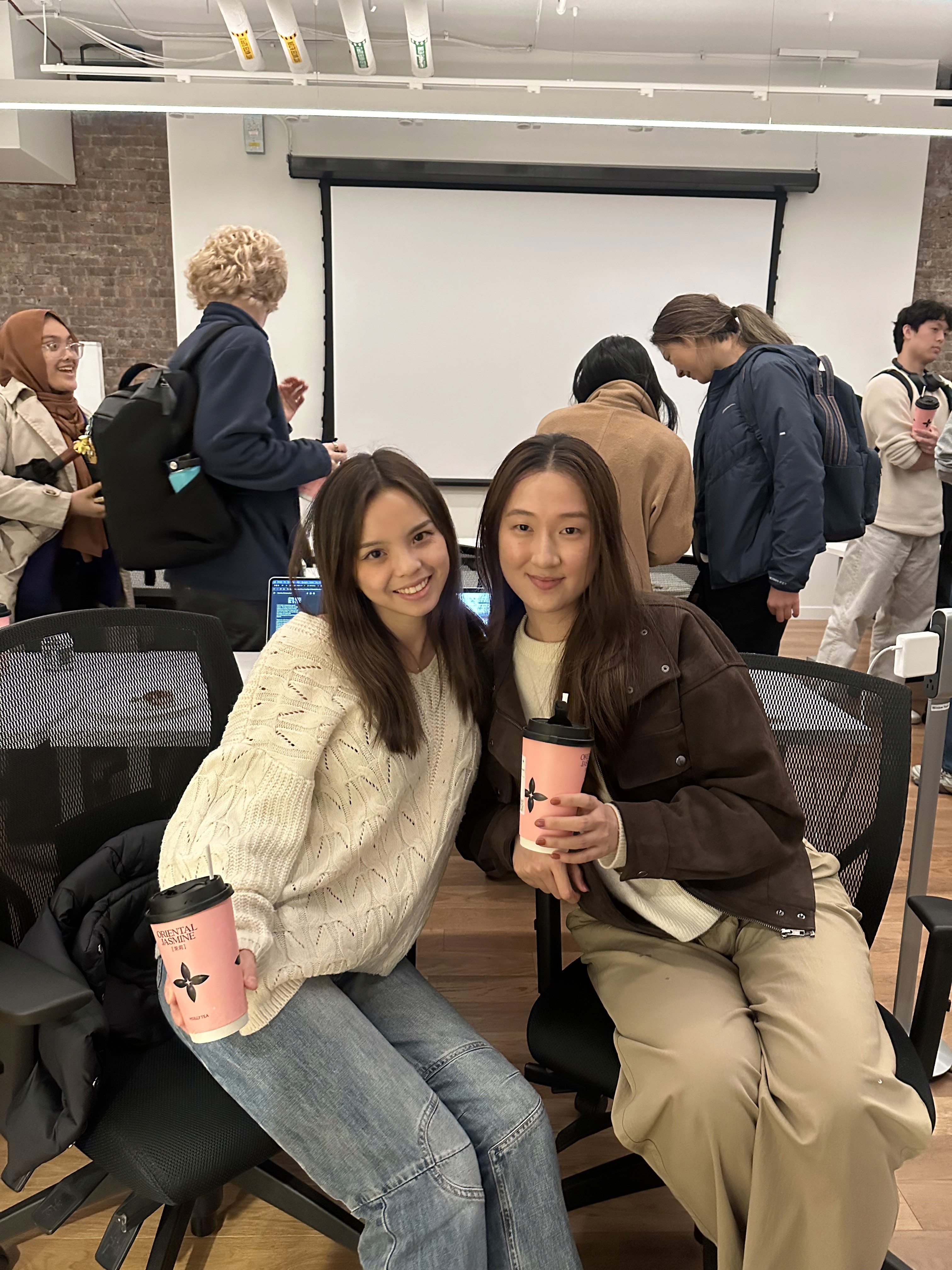
My friend and fellow designer, Louise, and I went to a Friends of Figma event hosted by Elizabeth Lin (Design is a Party). We had one hour to pick a prompt from this generator and build it in Figma Make. We had a lot of fun and even won most likely to ship 🏆!

Prompt we chose from the generator
Co-brainstorming with Gemini, prompting Make
We spent the first 15 minutes discussing our vision of a networking tool inspired by the swiping mechanism used in dating app.
Let's make a networking app for robots. The main mechanism will be swiping on profiles similar to hinge (screenshot attached) where you will see a set of profiles, each profile has an image of a robot with accompanying list of credentials like a resume.
These are some ideas of what the credentials could be.
Mixing the swiping mechanism of a dating app with the professionalism of Linkedin
Consider what robots are looking for (enabling robots to set criteria):
Name of robot
Model type/unit name
Manufacturer
Primary function/role (purpose)
Special skills:
Its robotic capabilities
Does this robot have sensors?
Location
Personality
What is the robot looking for (industry wise, company, etc)
Prev. experiences
Number of robot friends (degree of separation)
Recommendation section for which
Robot has to answer prompts
Robot profiles can be called ‘datacards’
Let's start from the default tab with swiping on profiles. Use Three.js for graphics that show robot profiles in the vintage, retro style with sepia tone. See attached images for visual inspiration.
* Attached: 2 images (Screenshot of Hinge profile [shows swiping mechanism] and Sepia robot [shows visual style]) *
Initial Make prompt, ideas list generated with the help of Gemini

Quick wireframes of main screens

Visual Moodboard, which we later fed to Figma Make
Refining, refining

Results from initial prompt
We were honestly pretty impressed by what Figma Make produced from the get-go. We spent the rest of the hour fine-tuning our prototype.
Visually, the design looked flat
Images were not what we'd expected. The swiping animation was clunky and the check and x CTAs were too small. The typography was boring. There was not enough visual contrast. We copied the design into Figma to manipulate the text and buttons before feeding it back to Make and refining it further.

Copied into Figma → manipulated text and buttons → fed it back to Make
Usability-wise, Make was solid
In terms of content, Make was strong at understanding our asks and populating filler data without us explicitly asking it to. For functionality edits, we fed Make our rough wireframes with asks.
Change the connect tab into calling it 'feed' and have it be a page where you see a list of posts similar to LinkedIn with robot profiles. It's essentially a global feed of recommended content where robots are posting content and possible jobs. You can similarly click into a post and see that robot's profile, and again choose ot like them and start a chat if they match.
For the message tab, show a list of profiles you have matched with with a chat history. When I click an individual profile, it should open ot a chat that shows my list of chats and enable the ability to text back.
*Attached: 3 images (Feed layout, Messages/matches, Individual chat)
Tapping into the AI's knowledge base
Instead of telling Make what to do with the swiping animation, we tried asking what it already knew.
Is there any other animation we can explore for the cards when someone swipes left or right?
The AI returned a list of possible animations, and at this point I felt like Make was on the same page as us, so I decided to try its recommendation (but not without adding a comment about an existing pattern that I liked).
Let's try it. Remember, I really like Hinge's swipe animation.
It looked pretty nice. I remembered reading somewhere to use positive reinforcement when prompting, so I made sure to encourage Make with a little compliment before requesting it one last finishing touch.
That's really nice. add more contrast between the card and the background so it's more obvious that we are swiping on cards. also, can you add a 3d effect so it looks more retro? Like this aesthetic (see attached)
* Attached 1 image (Sepia-toned UI with color screenshot)
What we learned: a lesson in prompting
In this challenge, we found Figma Make's "copy design" function quite helpful in allowing us to quickly edit parts of the UI. As AI sweeps into our daily workflows, it's been fascinating to fluidly switch between generative creation (prompting) and direct manipulation (traditional pixel-pushing).
We attached images for reference in several of our prompts. However, we found that simply attaching the images was not effective. Rather, we needed to explicitly tell the AI where in the images to look and what to do with that information.
The AI could be slow sometimes, so with limited time, it was important to be intentional with what we were asking of it. Sometimes when we wanted a "small" change such as changing the look of the buttons, we ended up needing multiple prompts. We're still learning more about vibe-coding each day, and effective prompting is a skill I'm keen to learn.